
10 Common Errors in Preparing Print Files
Save Time & Money with These Tips on Preparing Print Files
When businesses need to print a project, it seems like the design can’t be completed fast enough. Once the files go to the printer, it’s usually a big sigh of relief. But the timeline from final design to printed materials on your doorstep can be significantly extended if the right steps aren’t taken to prepare files for print. By focusing on these 10 things for preparing print files, companies save time, money, and the stress of thinking the work is done only to find something wasn’t correct. Also, they often receive an overall better final product.
1. Accounting for Document Bleed
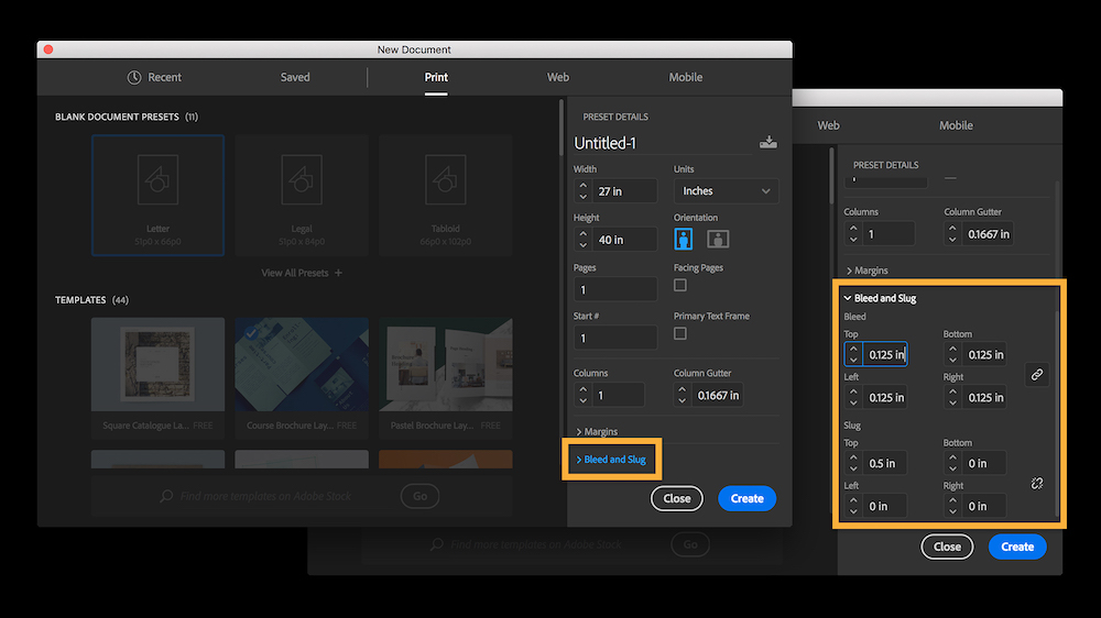 Any print file includes what’s known as “bleed,” the extra margin on an image that allows for inaccuracies to be trimmed off once the page is printed. Bleed on any document should be set at .125 inches. This is not only important for preparing print files but also for the folding process. If the bleed is not properly accounted for the finished product will show a white gap when folded. Bleed is something every print provider should be checking before sending a project to manufacturing. Preparing your print files today? Learn more on how to set a print bleed on Adobe tutorials.
2. Send a Print-Ready PDF
 If a project is being created in a design program such as InDesign, sending the InDesign file to your printer will be just fine. If you are not creating it in a design program, print-ready PDFs are incredibly helpful to a printing partner. These file types preserve settings for bleed, maintain offset for the margins, sustain a high resolution, and create correct color palettes. The good news is that most programs allow users to export as a print-ready PDF. If you just send an Excel or PowerPoint file instead of the PDF, it’s possible that the computer used to open it on the receiving end could automatically make formatting changes if the version is different.
3. Use a Suitable Program to Create the File
 Programs such as InDesign use industry-developed packaging features to assemble graphics, links, and font files together in a compressed folder. On the other hand, programs such as PowerPoint or Excel are intended for screen presentations, not printing. Printing directly from one of these programs could lead to a variety of issues, including color inconsistencies, type flow and bleed errors. If you must use one of these programs, it’s advised to send both the raw file (with all links and fonts) as well as an exported PDF file. When starting to prepare digital artwork use one of the files listed on our print specifications sheet.
4. Deliver Image Files with High Resolution
 File resolution is one of the most important aspects of quality printing, and anyone looking for a great final product should always review these specs before sending. The ideal resolution is 300 Dots Per Inch (DPI). Anything below 200 DPI usually triggers a warning, and anything below 150 DPI should stop the process completely. Subsequently, the image may have to be replaced. Otherwise, it will come out looking low-quality or grainy. The size of the image or graphic is also a contributing factor to quality. If an image is enlarged, there is an equivalent decrease in resolution. For instance, doubling the size of an image with 300 DPI will cause the DPI to fall by half to 150.
5. Use an Accurate Page Count
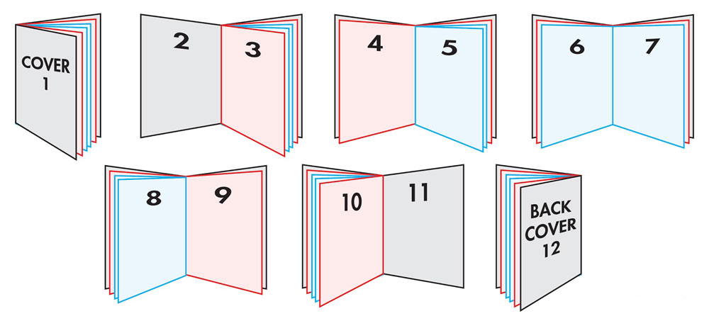 It’s not uncommon for printing partners to receive an estimated page count before the job is fully designed. While this helps in preparation of a quote, if the number goes up or down later, this will cause delays as new budgets and timelines are approved. Page counts often go up after quotes because the project owners or designers make changes. It can also be a common issue when Word files are sent for printing, due to changes in the margins or text flow between different computers. This is particularly true with booklets or catalogues, which need the page number to be divisible by 4 to account for folding or binding.
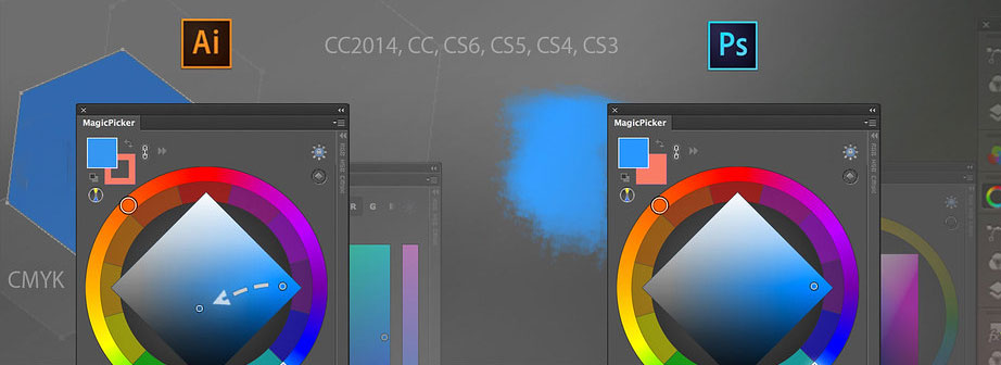
6. Set Up Color Spacing Correctly
 Color spacing means the range of colors that a printer can recognize and put onto the page. It may surprise you to learn that not every machine can print all colors on demand. The Red, Green, Blue (RGB) color palette should never be used for print projects. The Cyan, Magenta, Yellow, and Black (CMYK) palette mixes colors to create more varied hues. Files with varied colors should be set to CMYK so that a printed version captures those hues. Spot colors, or colors created with a specific PMS, are also acceptable.
7. Digital Printing in Shades of Black
 It may be tempting to think of the color black as simply that: the color black. But rarely, if ever, is black comprised of only black hues. Rather, rich colors are a mixture of several hues. These colors need to be built manually for digital printing with a process that incorporates many colors to allow for complete saturation. This is something to discuss with your designer any time you have black colors in a file that is intended for physical printing.
8. Send Over Font Files
 Choosing just the right font is a keystone of any design project that includes text. But fonts all have different personalities and don’t always react the same in a printing environment, and some may be covered by specific licenses. For this reason, it’s important that font files are sent along with the rest of the project files. It is true that substitutes can be used in extreme cases, but these can cause problems and make the project turn out incorrectly. Make sure your marketing has fonts stored and shared, or select and download brand standard fonts from sites like Google Fonts.
9. Spellcheck! Spellcheck! Spellcheck!
 We may think of the spellcheck function as something reserved for text-only documents, but this is often overlooked when preparing image files for print partners. Many jobs will get to plate or print before spelling errors are discovered, causing delays and extra costs for a client. Thankfully, programs like InDesign feature spellcheck tools, so this error can be easily avoided with careful foresight. Use free writing assistant tools like Grammarly to triple check spelling and grammar prior to sending.
10. Clean Up Your Files
 This issue arises most often when files come directly from designers, as there can sometimes be elements like unused logos or images left off to the side of a print-ready design. These linked items will be sent when packaging a file for transport, thus causing the overall file size to increase. To ensure no unnecessary items are included, any elements not intended to be printed should be deleted by the designer.
To recap, following these 10 steps to preparing print files correctly helps both clients and printers avoid any mistakes. That fateful term “going to print” means you’ve paid for the final file you have submitted (and can’t go back). Including an experienced print partner early in your process can help any printing project go more smoothly and come in on budget, saving you both time and money.