Folded Direct Mailer FAQs to Increase Engagement

You may have heard that print marketing is dead, but research shows the opposite is true. Marketers report that sending a folded direct mailer can create more engagement.
- In 2017, companies spent $167 per recipient on folded direct mailer campaigns and sold $2095 worth of products per person—a ROI of 1255%!
- 56% of customers found folded direct mailers to be the most trustworthy type of marketing overall.
- In a survey by Nielsen, 92% of Millennials preferred folded direct mailers as a channel for information about B2C purchasing decisions.
Data shows there will be a print & mailing Renaissance. Marketers may be ready to dive in but not sure where to start. Your effort is best used to create a folded direct mailer that will have lasting impact. Whether you have a basic letter you want to fold and send, or a brochure that does something more. As printers we’ve seen the best and the worst of folded direct mailers, and are here to share our insight. This article includes some basic best practices we’ve learned about designing an impressive and effective folded direct mailer.
When Should a Business Try Creating a Folded Direct Mailer?
A folded direct mailer works great for both large and small marketing initiatives. Whether you need to communicate with a big list of tens of thousands of new prospects, or reach a select audience you already know well. A stunning folded direct mailer makes a very different impression than one more subject line in an already-cluttered inbox. The average person receives around 2900 marketing touches per day. Here are some instances when folded direct mailer can help you stand out:
- Growing Brand Awareness: A folded direct mailer is statistically more likely to be opened and acted on immediately. Plus, over 90% of readers usually follow calls-to-action to engage further on social media.
- Targeted Communication: The demand for personalization in marketing is also affecting folded direct mailers. Direct mail allows marketers to personalize images, copy, and offers based on different segments of their audience.
- High Response Rate Needed: Direct mail achieves a 4.4% response rate, as compared to 0.12% for email.
Any marketing initiative can benefit from an approach that integrates a folded direct mailer. You also get more mileage out of your investment. Especially as direct mail channels proves to drive more engagement online.
How Should a Designer Lay Out a Printed Folded Direct Mailer?
Designers find the answer to this question is tough to nail down. Every folded direct mailer is different, depending on the content and goal of the campaign. However, among the more basic folds we see, there are some best practices for designers working on folded direct mailers.
C-fold or Letter Folded Direct Mailer
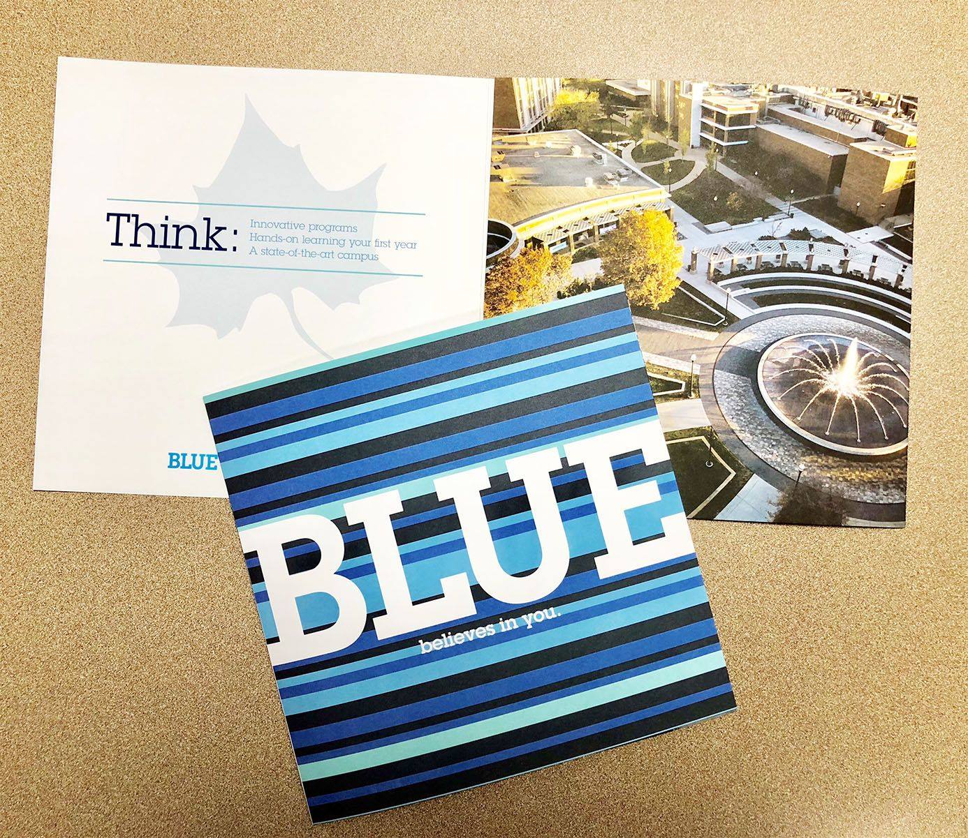
This is by far the most common fold for a print mailing. Also called a tri-fold brochure. It offers everything from company overviews to personalized letters that can be laid out in this simple yet spacious design.
We see one of the most common layout issues with tri-fold brochures. Designs submitted bleed over the folding area. This is when images or text from one panel of the brochure wraparound slightly to the panel behind. You can always remember to leave a little extra margin and be concise in copywriting, too avoid this problem.
One way you can save time and money is by taking advantage of automation services from your print mailing provider. Keep in mind that some tri-fold brochures may need to be inserted into their envelopes in a specific alignment by the machine. Sometimes, not knowing this leads a brochure to be designed and printed, but then it must get put in the envelope backwards or upside-down. However, there may also be other envelope options or workarounds, so be sure to talk with your provider.
Gate Folded Direct Mailer
A gate fold allows marketers to create a brochure with visual impact that invites recipients to “open the doors” on your message, whether an invitation or announcement.
It’s important to ensure your gate fold brochure is easy to follow and read. Trying to say too much in this brochure can take away from the impact and relevance of the creative folding.
Lastly, when using custom folded direct mailer and getting innovative, marketers must always be aware of USPS costs. If the mailing is thicker than ¼ inch, postage charges will be higher.
Double Gate Folded Direct Mailer
A double gate fold allows marketers and businesses to display lots of nuance in a small direct mail or print piece. For those with a story to tell, this eight-paneled brochure allows the narrative to be laid out exactly how you want the recipient to experience it.
As with tri-fold brochures, bleed over can be common in gate and double gate folded direct mail pieces. Images and text should be situated at least 3mm from the margins to ensure everything will fit as designed.
Fold placement in these designs is usually essential. Double gate folded brochures are among the types that should be considered for scoring along with printing. This means lines are pressed or etched into the paper to make folding easier and keep lines crisp. There are many ways to score paper during or after printing.
Folded direct mailers are still an effective and important part of a comprehensive marketing strategy.
A folded direct mailer is an unique way to stand out from competitors. They also create more authentic connection with customers and potential customers. You know that feeling. Receiving a folded direct mailer feels like an event. Digital marketing can’t compete with this tactile experience. When partners support your mission too, taking advantage of the opportunity to get your message into the hands of customers is easier. Our last piece of advice for marketers is to find an expert printer who understands these nuances. You shouldn’t have to be the visionary and know all the execution components of a folded direct mailer. We can help execute the vision for a print marketing piece while respecting the budget and keeping on time with printing and delivery.


It is great information. Thank you for sharing